Outcome
This project represented my initial experience in designing a feature from inception to completion, offering invaluable insights and lessons. In addition, we delivered multiple presentations to our client, which led to the successful acquisition of two contracts with YouTube.
Background
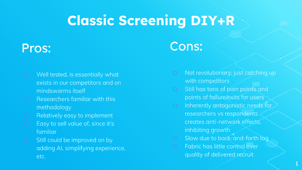
The typical approach for conducting video research involves engaging with companies like Dscout or Voxpopme to create a screener and recruit participants. Subsequently, researchers would sift through numerous screener responses, select candidates based on their replies, and then proceed to gather responses to the research questions. Finally, researchers would review and analyze the respondents' answers to extract valuable insights.
This way of conducting research has a lot of pain points and points of failure for users where the recruits may not always be responsive. This also means that there is always a delay between conducting research because there is such a back-and-forth lag.
Our proposal centers on the implementation of profile attribute flags acting as roles, allowing administrators to handpick respondents who fulfill specific criteria for invitation to an exclusive database. Within this database, participants would gain eligibility for a greater number of studies.
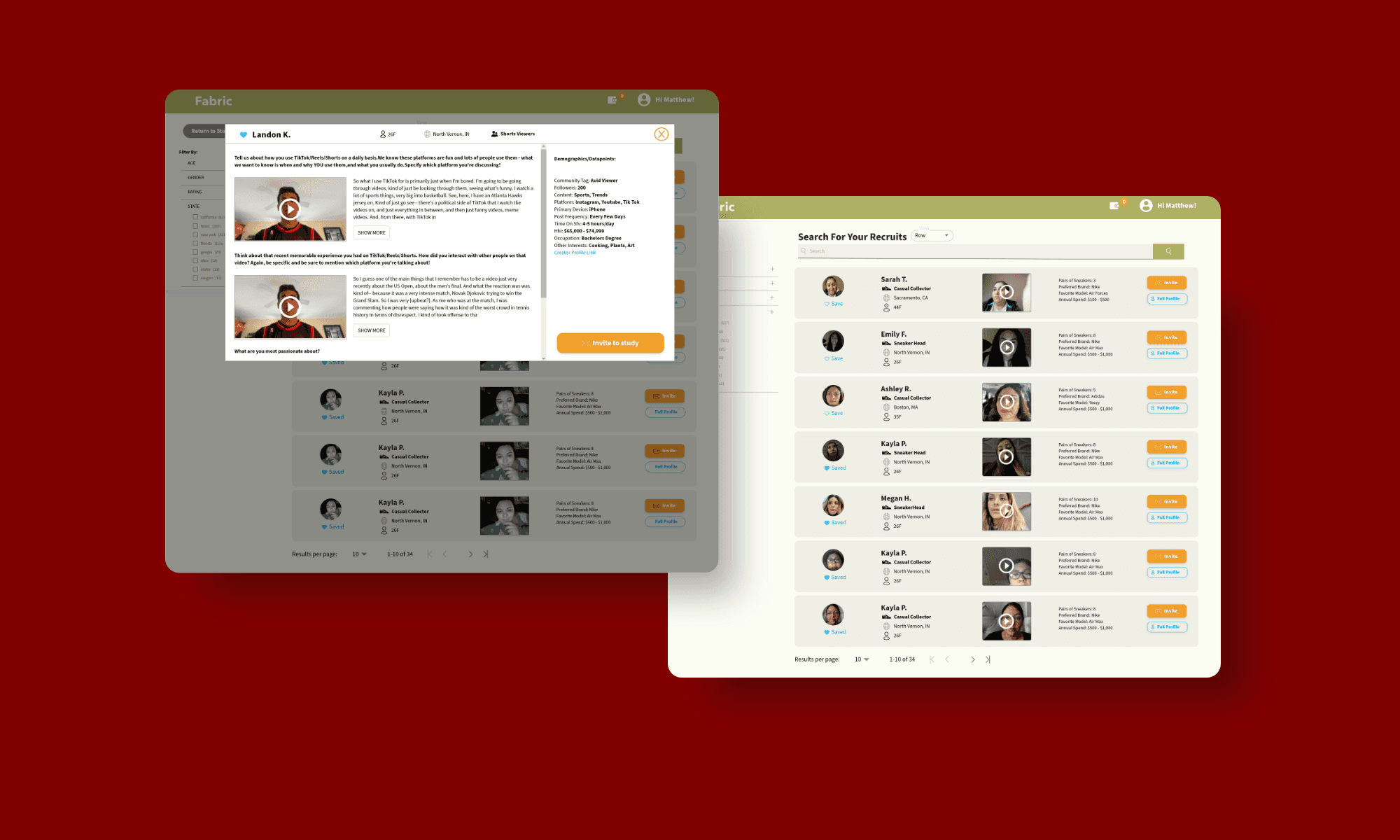
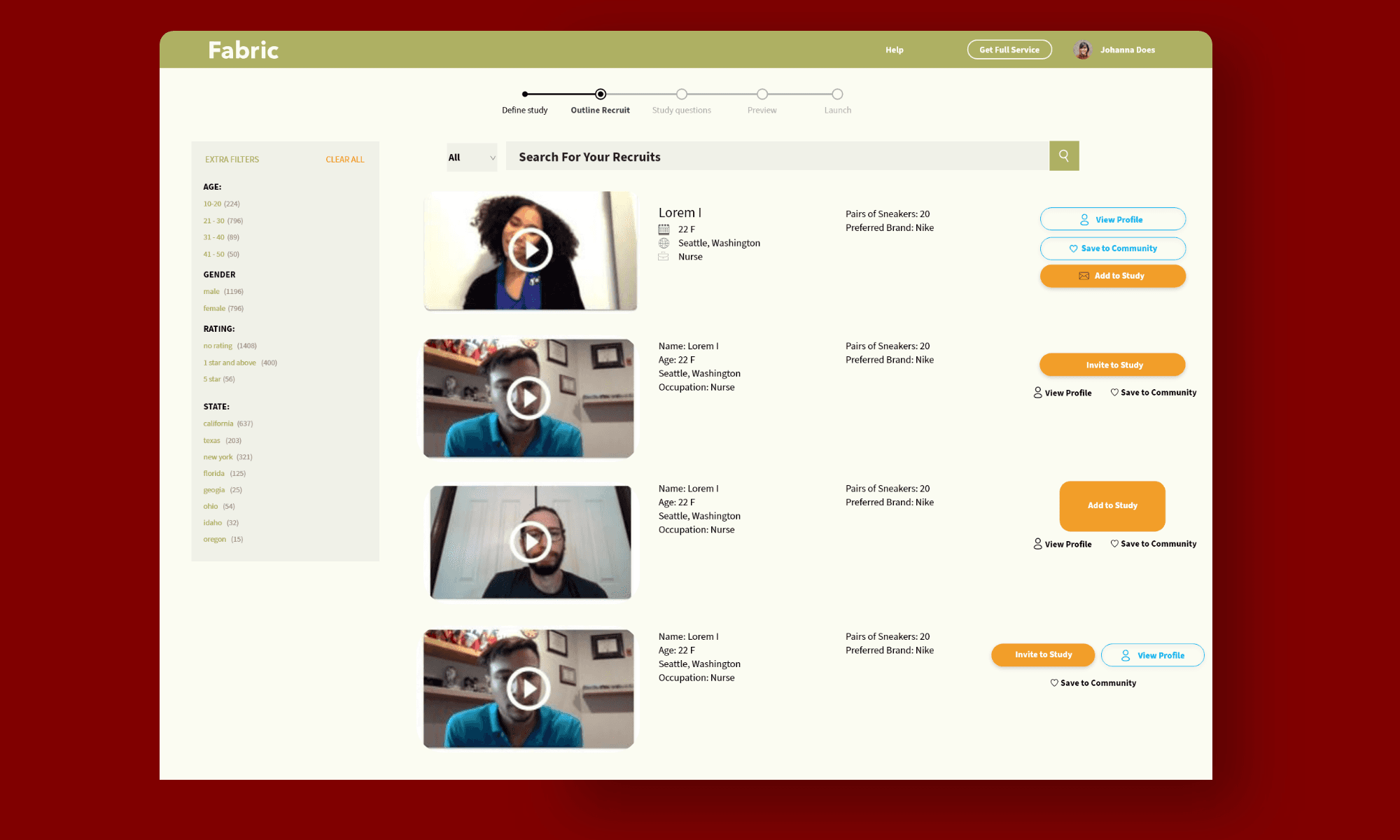
Researchers would be able to browse and search the database, with relevant profile data on each recruit as well as access to their profile video and any category specific profile videos.
When building a study or after a study is launched, researchers will be able to invite respondents from the pool into their study. I led the efforts in designing the dashboard to ensure that the users will have a both usable and useful product.
Research
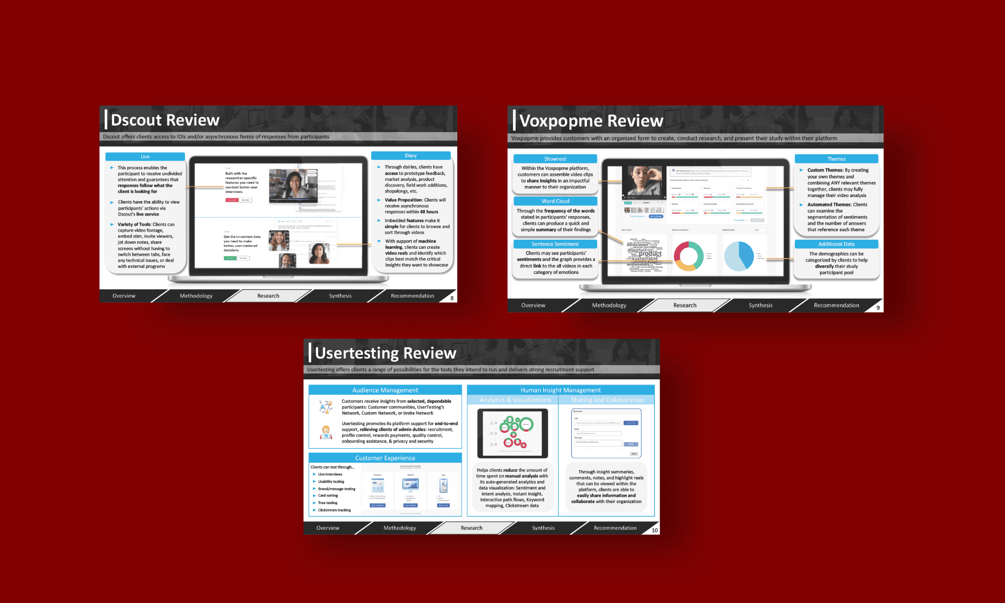
We conducted a competitive analysis to determine if any of our competitors had previously implemented this feature. Our examination included an assessment of platforms such as Dscout, Voxpopme, and Usertesting to evaluate their current features. Based on our findings, we concluded that none of our competitors offer a platform enabling access to their own community of recruits.
This gave us some validity that this feature is unique and may give us an edge against our competitors.
Challenges
To begin with design, there was a clear need to create a new dashboard where researchers are able to search for recruits. There was also a need to create a modal pop-up where they are able to take a deeper dive into the recruit’s profile. It took many iterations to finally be happy with the final product.
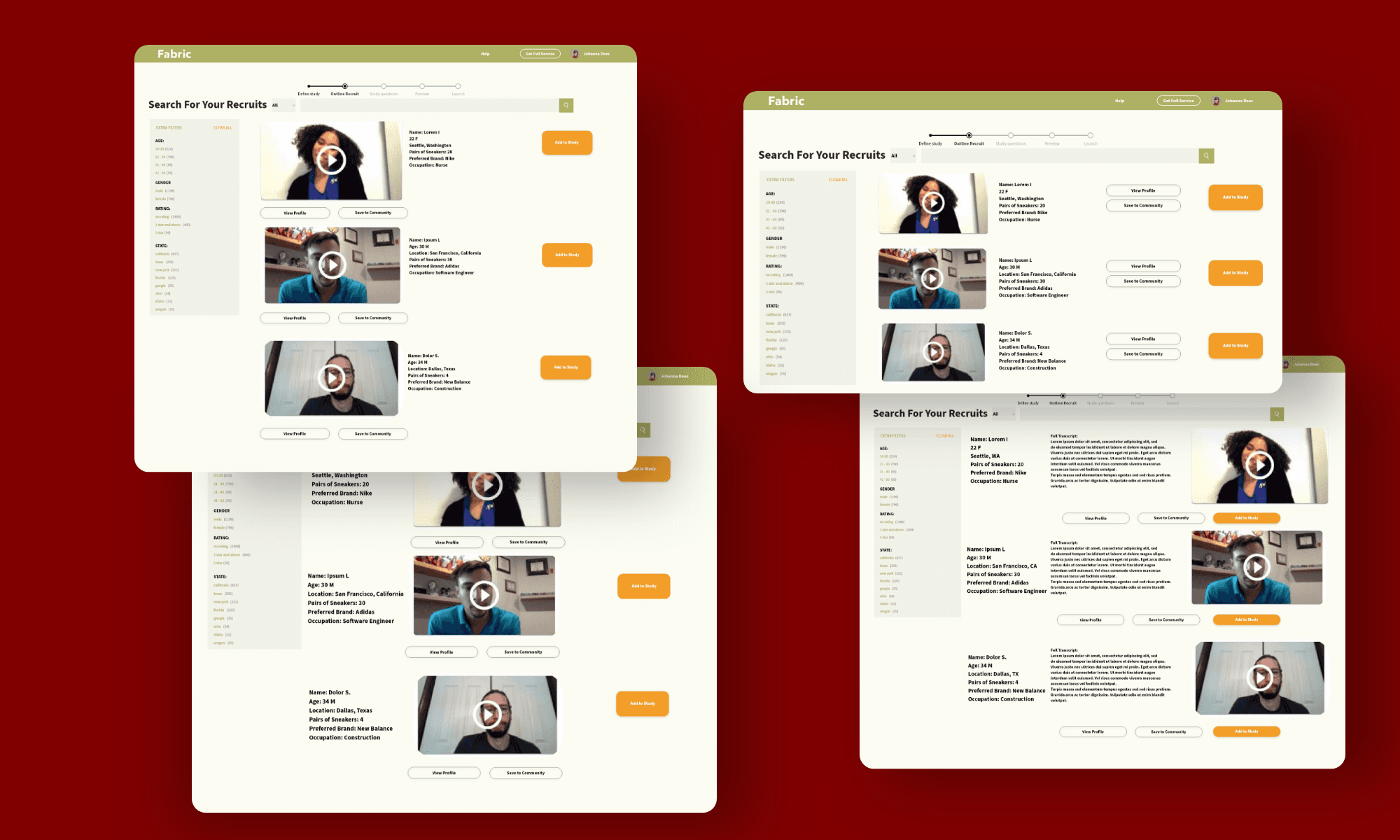
My initial prototype had several shortcomings, notably the absence of color to distinguish buttons, the lack of categorized information within each user card, potentially causing information overload, and the omission of icons to enhance readability and usability.
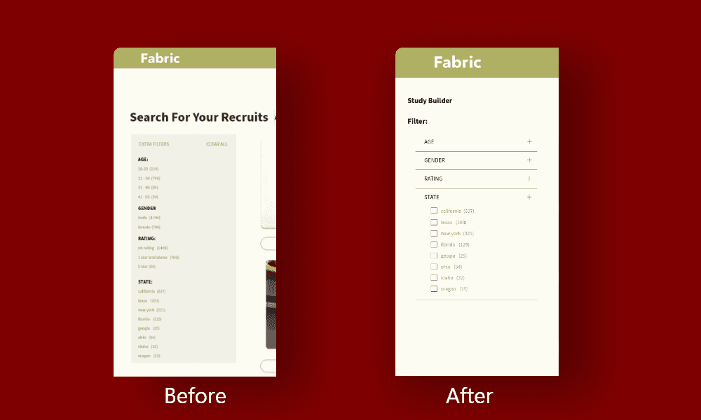
I also noticed while creating the prototype that our current filtering system lacked such that all categories were already expanded and there was no way to collapse each category. This could have the potential to further overload the user with so much information.
Filtering System
Given the large pool of recruits, our priority was to ensure the efficiency of the filtering system. Upon observation, I found the existing filtering system to be lackluster and convoluted. To address this, I conducted research on best practices and analyzed how various eCommerce websites filtered their items.
Button Positioning
Another challenge I encountered was determining the optimal placement for key buttons like 'Invite,' 'Save,' and 'View Full Profile.' The dilemma revolved around whether to stack all three buttons vertically or to distribute them differently.
After careful consideration, I opted to stack 'Invite' and 'View Full Profile' on top of each other, placing 'Save' beneath the user's profile picture. This decision stemmed from the belief that 'Invite' and 'View Full Profile' held greater priority over the user, warranting closer proximity for easier access.
Cards Display
Another obstacle was determining the optimal layout for displaying recruit cards. One issue we encountered was the abundance of information we aimed to present about each recruit, potentially overwhelming users during the selection process.
Initially considering a two-column card display, we found it constrained the amount of information we could include. Through numerous iterations and input from the Head of Product, I ultimately arrived at a display layout that effectively balanced information richness without overwhelming the user.
Conclusion
With this project being my first feature that I designed I am genuinely pleased with the final outcome. An aspect that warrants improvement is the absence of user research conducted prior to presenting the feature to prospective clients. Following my reading of Steve Krug’s “Don’t Make Me Think, Revisited,” I learned about the efficacy of conducting usability research with just three participants to identify potential issues.
